Project Overview
On the corner of Campbell and Mill is Brick City, Missouri State University’s School of Fine Arts. Sitting a few miles away from main campus, Brick City was remodeled in 2007 after serving as cold-storage facilities for cheese and meat processing. The 100-year-old industrial buildings were renovated to retain its rich history, complete with exposed brick and mid-century furniture. Brick City is known as the “urban oasis of creativity” that houses all of Missouri State’s art students and faculty.
Brick City Recycling is a project dedicated to managing and recycling the waste production throughout this area of campus. The branding project is meant to resonate with its primary target audience: artists and creatives.
Logo and Direction

Direction
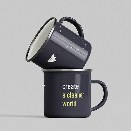
My design direction takes inspiration from the ideas of the ideas of creative transformation, whether it is in the classroom or the up-cycled furniture that lines the halls.
What is a paper plane but one simple ingredient transformed into a vessel of creativity? The imagery of the paper plane represents the cross-section of utility and creativity. Whereas some associate recycling with the mundane, it is often the base ingredients that can create magic. Recycling is a concept that strives to make utility out of the waste, I wanted the branding and design to reflect those ideals that creatives often share.
Typography and Branding

Typefaces
Design in Use
